Painting the walls
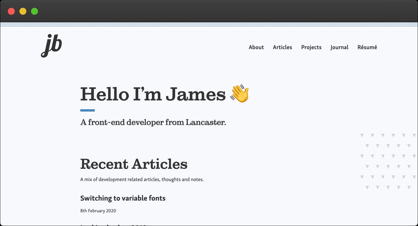
This week I did a ‘soft launch’* of the redesign I’ve been working on for my personal site.

We all know the difficulties that come with building your own site. When you have no design to work from, or are not given a specific set of amends to complete it's very easy to begin to question every decision you're making, every little spacing amount you add - maybe just me?
I had this thought recently with the previous version of this site. When I first built it, I had visions of large amounts of whitespace and nice large serif headings. However, for whatever reason, I decided a rather garish animating gradient would be my focal point. I think it's because I had been working on some nice client work that used some lovely gradients, anyway let's just say that I didn't do myself any favors with it.
The aim
I decided to try and create my original vision, and what you see now is what I came up with. Gone are the more blocky section based layouts (and the gradient) and in its place is a more simplistic feeling site with increased whitespace.
I've replaced the Inter variable font with a serif font for headings and a slightly more rounded sans-serif body font which I think gives my content a bit more of a hierarchical structure - although I do still love Inter.
The content
This has pretty much just been a 'reskin' - I'm fairly happy with the way I'm pulling data from my nunjunks templates and the collections I have for articles, journals, people, and work. I have added single project posts now, giving me a space to write in a bit more detail about some of the processes in my work.
The other major addition to the site has been the résumé page. this is controlled via the CMS (Netlify CMS) which will allow me to easily update the content should I need to.
The future
Now the new look of my site is live. There are a few tweaks I need to make after doing some testing - which was kind of the reason for the 'soft' launch.
I'm also hoping it'll push me to write some more articles for the site, both development, and journal ones. There's also still a couple of items from my todo list I need to sort (dark toggle etc)
Anyway, I hope you like the new design, and please let me know if not. You can Log a bug here.
As often happens with these things, I'll probably end up looking at it so much that I want to change it again in six months!
* Didn't advertise it to my ~35 avid Twitter followers